Reading the data
A comprehensive guide on how to read the data, and use our interactive data dashboards
How to read the data
ADII scores range from 0 to 100. The higher the score, the greater the level of digital inclusion. ADII scores are relative: they allow comparisons across different social groups, different geographic areas, and over time.
Each of the Index dimensions – Access, Affordability and Digital Ability – are equally weighted to derive the total Index score.
Total Index scores have been classified into four groups:
- Highly excluded (45 or below)
- Excluded (above 45 and below 61)
- Included (61 and below 80)
- Highly included (80 and above)
The threshold for inclusion indicates that a person scoring above that level can make accessible, affordable, and effective use of the internet. These thresholds are based on the distribution of 2020 Index scores and have been retained for 2021 and 2023 to measure change from the initial scores.
All ADII scores and percentages are weighted to the Australian population.
Affordability is measured as a ratio of the potential cost for a quality internet bundle to the distribution of household income. This ideal bundle enables both quality and uninterrupted connectivity through the following three components:
- A fast internet connection (such as that provided through a cable (HFC) service, NBN 50 or above, or 5G wireless service)
- An unlimited monthly data allowance through a fixed broadband service
- Mobile broadband or mobile phone data allowance above 61 GB per month
The affordability ratio is converted to a score between 0 and 1 and multiplied by 100 to present a metric consistent with all dimensions.
To enable more meaningful understanding of the impacts of affordability pressures, we also ask respondents questions about the compromises and sacrifices they have made to afford internet access, and present the cost of a quality internet bundle as a proportion of household income.
Affordability stress occurs when the lowest income groups (typically defined as those in the lowest 40% of the income distribution) are required to pay a relatively large proportion of their income to access that internet bundle.
The percentage of household income needed to buy an internet bundle is broken up into four categories:
- Up to 2% of household income
- Up to 5% of household income
- Up to 10% of household income
- More than 10% of household income
Having to pay more than 5% of household income on the internet bundle would tip many lower income households into affordability stress, compromising their capacity to pay for other essential household items. To avoid this, many lower income households buy cheaper and often inferior connections and devices that limit the quality of connections and opportunities of internet use.
Households that need to pay more than 5% of their household income to access the internet bundle are considered to have ‘low Affordability’. Households that need to pay less than 5% of their household income are considered to have ‘high Affordability’.
Age categories in the Index are broken into five ranges:
- 18-34
- 35-44
- 45-54
- 65-74
- 75+
Classified into two categories:
- Metro (state/territory capitals)
- Regional (rest of state)
The COVID-19 data presented in the interactive data dashboards was collected only in 2020.
Education status is grouped according to four levels of completion:
- Less than secondary
- Secondary
- Certificate or diploma
- Bachelor’s degree and above
Classified into three groups:
- Employed
- Unemployed (actively looking for work in the past four weeks)
- Not in the labour force (including but not limited to retirees, students, carers, and home duties)
Describes people who identify as being of Aboriginal and/or Torres Strait Islander origin.
The 2022 data collection was supplemented with a sample of 495 First Nations persons from 10 remote and very remote communities of the Northern Territory, Western Australia, Queensland and New South Wales through the Mapping the Digital Gap project. This project is being conducted from 2022-2024 and will provide insights into the levels of digital inclusion held by remote First Nations Australians and track changes in the scale and nature of the digital gap over time. While efforts have been made to make the findings representative through the use of various statistical techniques, because of the sampling technique used, estimates made for this group should be treated as indicative and not reflecting the broader First Nations population. No special First Nations collection was undertaken for urban and regional areas this year and results obtained based on national sampling methods of First Nations people should be treated with caution due to very small sample sizes.
Prior to 2023, samples did not include sufficient First Nations respondents to generate reliable data, and we therefore did not provide a score for First Nations people.
Describes the difference between Index scores. For example, the gap between the national average Index score and the score given to a specific region or group in that same year. The term is also used to describe the difference between Index scores among social groups within the same year (e.g. the difference in Index scores between the oldest and youngest Australians).
- Male
- Female
- Non-binary
Note, the ADII draws on a national sample size ranging from 2,287 (2021) to 5,132 (2023) which does not provide sufficient non-binary respondents to generate reliable data. The Index therefore does not provide a score for non-binary populations.
Respondents are classified into four groups based on their Index scores:
- Highly excluded (45 or below)
- Excluded (above 45 and below 61)
- Included (61 and below 80)
- Highly included (80 and above)
The threshold for classification as ‘Included’ indicates that a person scoring above that level can make accessible, affordable, and effective use of the internet. These thresholds are based on the distribution of 2020 Index scores and have been retained for 2021 and 2023 to measure change from the initial scores.
Housing tenure is presented in four categories:
- Outright owner or purchaser
- Private renter
- Lives in public or social housing
- Other
Household type is presented in five categories:
- Single-person household
- Couple without children
- Couple with children
- One parent family
- Other family (e.g., multi-generational household) and household types.
Income is presented in five income ranges, and is calculated at the household level. Each range covers approximately 20% of the population (one quintile or Q1-Q5). The ranges from low- to high-income are:
- Q1: under $33,800
- Q2: $33,800 to $51,999
- Q3: $52,000 to $90,999
- Q4: $91,000 to $155,999
- Q5: $156,000 or more
A bundle of goods that enables quality and uninterrupted connectivity through:
- A fast internet connection (such as that provided through a cable (HFC) service, NBN 50 or above, or 5G wireless service)
- An unlimited monthly data allowance through a fixed broadband service
- Mobile broadband or mobile phone data allowance above 61 GB per month
People who speak a language other than English (LOTE) at home.
Mobile-only users are people who access the internet primarily through a mobile wireless connection, rather than a fixed broadband service.
Occupations are grouped into one of the following high-level categories:
- Manager/Professional
- Technician/Trade worker
- Community/Personal service worker
- Clerical/Administrative worker
- Sales
- Machinery operator/Driver/Labourer
People who report the presence of a chronic disability, health condition or injury that restricts their everyday activities.
Based on self-selection of one or more of the following:
- Family Tax Benefit Part A or Part B
- Healthcare Card
- Pensioner Concession Card
- Commonwealth Seniors Health Card
- Age Pension
- JobSeeker Allowance
- Youth Allowance
- Disability Support Pension
- Disability Pension
- Mobility Allowance
- Carer Allowance
- Carer Payment
- Austudy
- Abstudy
- Parenting Payment (single or partnered)
- Other pension or benefit.
In addition to most states, territories and local government areas, Index scores can be compared by metropolitan versus regional locations.
Level of remoteness is broken down into:
- Major cities of Australia
- Inner regional Australia
- Outer regional Australia
- Remote Australia
- Very Remote Australia
These five levels are based on the Australian Statistical Geography Standard (ASGS) Remoteness Structure developed by the Centre for Housing at the University of Adelaide and the ABS. To illustrate the disparities between First Nations and non-First Nations people, particularly in remote and very remote Australia, we also provide a comparison of scores for these two groups by remoteness in the dashboard.
Small sample sizes can make survey results less reliable. A note will show if the sample size is low and should be treated with caution. Data will not appear in the interactive data dashboards if the sample sizes are not reliable.
2023 data was collected nationally between June and December 2022, with Mapping the Digital Gap data collected in 10 sites from February to August 2022.
How to use the interactive data dashboards
What are the interactive data dashboards? And why do we need them?
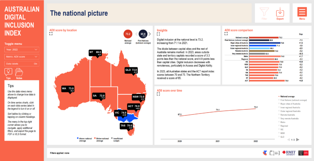
The interactive data dashboards allow you to explore the Index data for yourself in a visual and interactive format.
There are a total of 8 interactive dashboard pages. Each page focusses on a specific aspect of the Index, and contains insights, charts, and visualisations.
On each page, you can manipulate what is shown on charts, graphs, and tables, as well as filter and export the data.
Website menu
Dashboard menu
Navigating to the dashboard and from page to page through the main menu
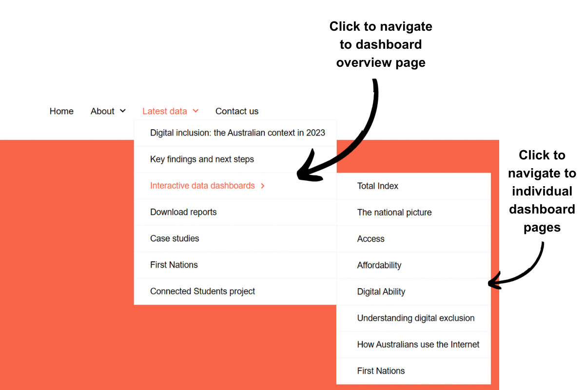
To navigate to the interactive data dashboards, hover over ‘latest data’ in the top menu, then hover over ‘interactive data dashboards’, and click on one of the six pages available.
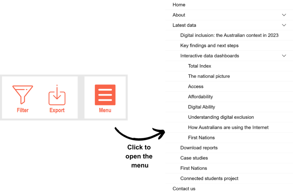
Once you are on a dashboard page, you can navigate to other pages by using the menu in the top right corner.
Simply click or tap the menu icon to open the menu, then navigate to a different interactive data dashboard page, or anywhere on the website.
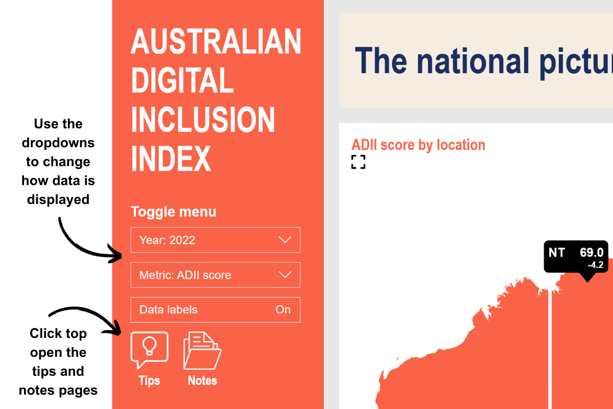
Using the toggle menu to change how data is displayed
On each dashboard page, the toggle menu, located on the left side of the page, allows you to manipulate how data is displayed.
Using the different drop downs in the toggle menu, you can:
- Manipulate which year is shown on the page. This will change the year that is shown in bar charts, column charts and tables, and will also change the number of years shown in the time series charts.
- Manipulate data cuts. This changes the subgroups which are shown in charts, graphs or tables. For example, selecting gender in the ‘data cut’ drop down will display the data by gender subgroups.
- Change metrics. Easily switch between metrics such as ADII Score, Access Score, Affordability Score, and Digital Ability Score.
- Turn data labels on or off. As you are interacting with each page, you may find that some charts become a little cluttered with lots of numbers. You can turn these on and off by clicking or tapping on the data labels toggle. If you want to see the numbers at each data point, just hover over it with your mouse or tap on it to display a popup with all of the specific data points.
- Access the tips popup. If you get stuck, you can click on the tips icon below the toggle menu for helpful hints on how to use various features on each page.
- Access the notes popup. The notes popup contains additional information around how data is collected, and the results seen on screen.
Interacting with charts and tables
The toggle menu isn’t the only way to manipulate the data that is shown on the screen. You can also use the following features, depending on what is available in the specific tile you are looking at:
- Hovering or tapping on the chart to see specific results. On each chart, you can hover over data points to see the results in a popup. This can be helpful if you have opted to turn data labels off in the left toggle menu, or if there are many data series on the one chart.
- Turning data series on or off in time series charts. On time series charts, you can manipulate which data series are shown on the chart by clicking on the data series in the legend. As default, only one data series is shown on time series charts, allowing you to turn on additional data series to see specific results.
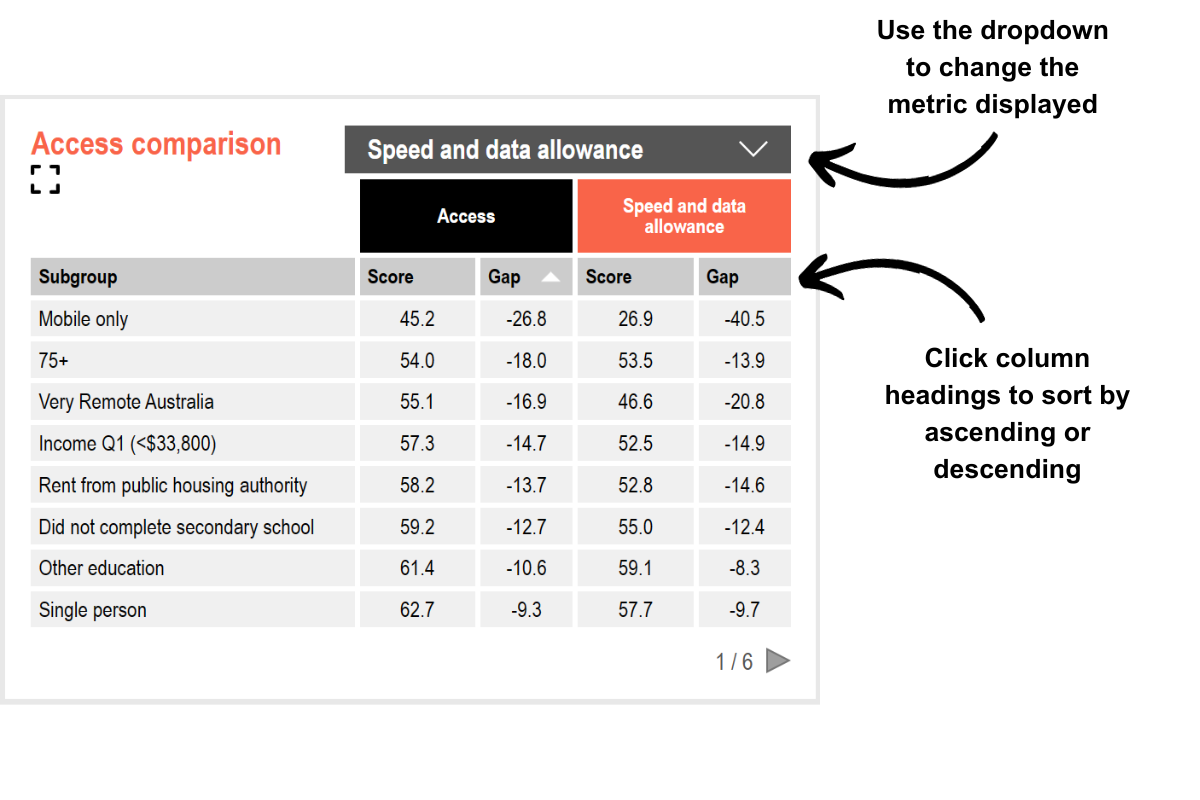
- Sorting data tables. Whenever a table is shown on a dashboard page, you can sort the table by clicking on each column heading. You can sort by any column in the table, in both ascending and descending order.
- Using drop downs. Some data visualisations allow you to change the metrics that are shown in that specific tile. When this is possible, a drop down box will appear in the top right corner of the tile. To change the metric displayed in the chart, click on the drop down and select your desired option.
Filtering the data
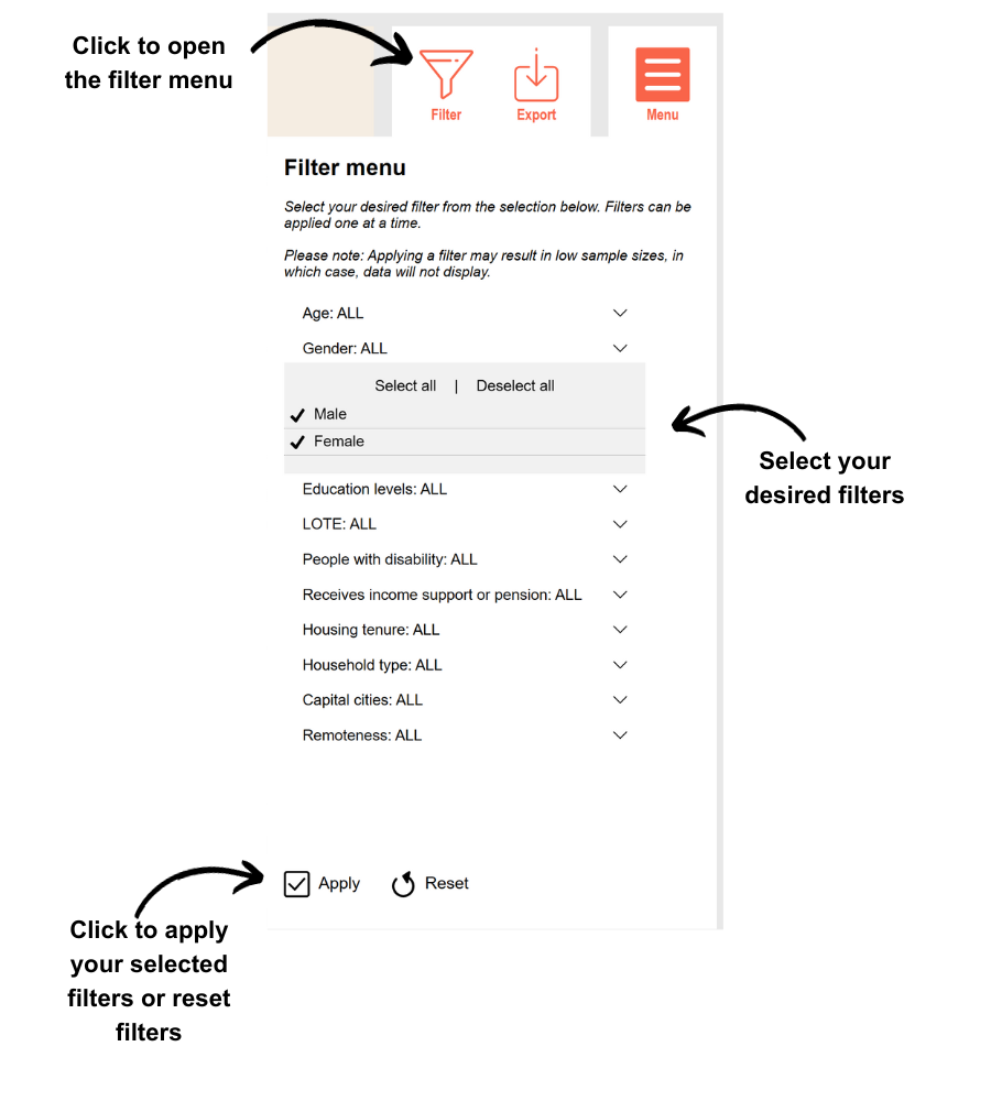
On some of the interactive data dashboards, you can use the filter menu to filter the data.
To open the filter menu, click or tap on the filter icon in the top right corner of the page. Once the menu opens, there will be a number of filters to choose from.
Clicking or tapping on each filter will open a drop down, allowing you to select your desired options. For example, you could filter by a specific age group by dropping down the age filter, and selecting a specific group such as 18-39.
Once you have made your filter selection, click on the apply button in the bottom left corner of the filter menu to apply your filter.
You can change filters any time by re-opening the filter menu, clicking reset, choosing your next filter, and then clicking or tapping apply again.
Please note that due to sample size limitations, only one filter can be applied at a time, and applying filters can result in low sample sizes, in which case data will not be displayed.
Filter and sample sample size indicators
Filter information is shown at the bottom of each page.
When a filter has been applied, the filter information on the bottom of the page will change, showing the specific filter that has been applied to the data.
There are three other filter indicators that you may see in the dashboard pages.
- Low sample size. If a specific data series has a sample of below 50 respondents, a yellow indicator will be shown next to the data series, along with a warning at the bottom of the page.
- Insufficient sample. If a specific data series has a sample of below 30 respondents, a red indicator will be shown next to the data series, along with a note at the bottom of the page. The data for the specific series will not be displayed on the chart, graph or table.
- Filtered / unfiltered. Some data visualisations are cut by specific subgroups and therefore cannot be filtered through the filter menu. When you apply a filter to the page, filtering indicators will show next to each tile heading, denoting which charts, graphs, or tables have been filtered, and which ones have not.
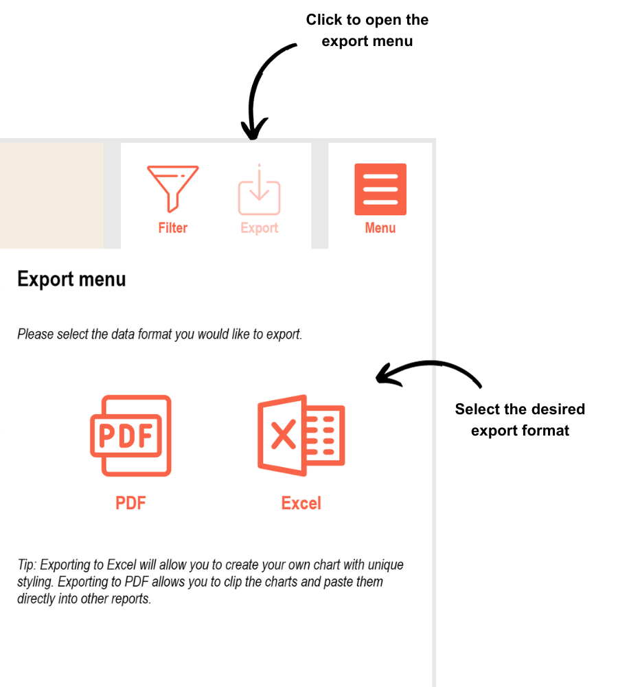
Exporting data
You can export the data that is shown on each interactive dashboard page to either PDF or Excel format.
To export data, open the export menu by clicking on the export icon in the top right corner of the page.
Select the format you would like to export to, either PDF or Excel.
A dialogue box will open prompting you to save the exported file to your device. Select a location to save your file and then click save.
Please note that the PDF and Excel export will export the entire page, including the data cuts you have selected, and any filters you have applied.